User Interface Guidelines
- Android Design
- Icon Design Guidelines and Android Icon Templates Pack
- Widget Design Guidelines
Android Design
- Create Vision
- Enchant me
- Simplify my life
- Make me amazing
- Design Principles
- Enchant me
- Delight me in surprising ways
- Real object are more fun than buttons and menus
- Let me make it mine
- Get to know me
- Simplify My Life
- Keep it brief
- Pictures are faster than words
- Decide for me but let me have the final say
- Only show what I need when i need it
- I should always know where I am
- Never lose my stuff
- If it looks the same, it should act the same
- Only interrupt me if it's important
- Make Me Amazing
- give me tricks that work everywhere
- It's not my fault
- Sprinkle encouragement
- Do the heavy lifting for me
- make important things fast


- UI Overview
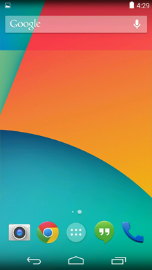
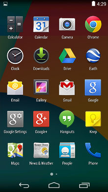
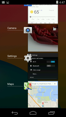
- Home, All Apps, and Recents
- Home screen
- All apps screen
- Recent screen
- System Bars
- Status Bar
- Navigation Bar
- Combined Bar
- Notifications
- brief message accessed from status bar
- Common App UI
- Main Action Bar
- View Control
- Content Area
- Split Action

- Action Bar - http://developer.android.com/design/patterns/actionbar.html
- General Organization
- App icon
- View control
- Action buttons
- Acton overflow
- Adapting to Rotation and Different Screen sizes
- Layout Considerations for Split Action Bars
- Main action bar
- Top bar
- contains tabs
- Bottom bar
- Action buttons (FIT)
- Frequent
- used 7 out of 10 times they visit the screen
- Use several times in a row
- Important
- Typical
- Action overflow
- Sharing data
- contextual Action Bars
- Action Bar Checklist
- Navigation Drawer - http://developer.android.com/design/patterns/navigation-drawer.html
Devices and Displays
- Be flexible
- Optimize layouts
- Assets for all
- BASELINE
- 32X32dp
Themes
- color
- height
- padding
- font size
Touch Feedback
- States
- Normal
- Pressed
- Focused
- Disabled
- Disabled & focused
- Communications
- Boundaries
Metrics and Grids
- Phone
- 320DP
- Density-independent pixel (dp) - http://developer.android.com/guide/practices/screens_support.html
- physical pixels (px) = dp * (dpi / 160)
- 360DP
48dp Rhythm
- user can target with finger
- spacing between each UI element is 8dp
Typography
- Text Size Micro - 12sp
- scale-independent pixels (sp)
- Text Size Small - 14sp
- Text size Medium - 18sp
- Text Size Large - 22sp
Color
- use color primarily for emphasis
Iconogrphy
- a graphic that takes up a small portion of screen real estate
- a quick, intuitive representation of action, a status, or an app.
Launcher
- a visual representation of your app on the Home or All Apps screen
- Size & scale
- Launcher - 48x48 dp
- for Google Play - 512x512 pixels
- Proportions
- Style
Action Bar icons
- Sizes & scale
- phone 32x32 dp
- Focal area & proportions
- Full asset, 32x32 dp
- Optical square 24x24 dp
- Style
- Colors
- enabled/disable opacity
Small / Contextual Icons
- Sizes & scale
- 16x16 dp
- Focal area & proportions - 16x16 dp / 12x12 dp
- Styple
Writing Style
- Keep it brief
- 30 character limit (including spaces
- Keep it simple
- Be friendly (you)
- Put the most important thing first
- describe only what's necessary, and no more
- Avoid repetition
New in Android
- Jelly bean - Andoird 4.1
- Ice Cream Sandwich - Andoird 4.0
- my phone is an Ice Cream Sandwich
Gestures
- Touch
- Long press
- Swipe
- Drag
- Double touch
- Pinch Open
- Pinch Close
Application Structure
- Calculator/Camera single screen
- Phone switch between different activities with deeper navigation
- Gmail/Play Store broad set of data views with deep navigation
General Structure
- Top level views
- Category views
- Detail/edit view
Top Level
- Put content forward
- Create in identity for you app
- Set up action bars for navigation and actions
Top Level Switching With View Controls
- Fixed tabs
- Spinners
Navigation drawers
Don't mix and match
Categories
- Use tabs to combine category selection and data display
- Allow cutting through hierarchies
- Acting upon multiple data items
Details
- Layout
- Lights-out mode
- Make navigation between detail view efficient

No comments:
Post a Comment